How to Build a Reddit Dashboard
How to build a Reddit dashboard starts with a narrower question than most teams expect: what decisions should this dashboard help you make every week? The useful version is not a giant BI project. It is a compact reporting system that separates subreddit performance, landing-page quality, and business outcomes clearly enough to decide what to repeat, what to stop, and where to investigate next.
Source-Backed Context
Reddit's business attribution docs explain the difference between click-through and view-through attribution, and they note a default setup of 28-day click-through and 1-day view-through attribution. If your dashboard mixes those views without labeling them, it will confuse everyone downstream. Source
Reddit's conversion-event documentation lists standard downstream actions such as Page Visit, View Content, Search, Lead, Sign Up, and Purchase. That gives you a cleaner way to anchor dashboard outcomes than score or clicks alone. Source
Google Analytics says report freshness varies and that processing can take 24 to 48 hours. It also notes that realtime and some other surfaces are best-effort, which matters when teams try to turn a Reddit dashboard into a minute-by-minute command center. Source
Google Search Console's Performance report lets you review clicks, impressions, CTR, average position, and filters across query, page, country, device, and date. That makes it a useful companion when Reddit discussion starts spilling into search demand rather than direct referrals alone. Source
What Should a Reddit Dashboard Help You Decide?
A Reddit dashboard should help you answer a short list of operating questions, not document every possible metric. If a chart does not support a real decision, it is decoration.
The core questions are usually:
- Which subreddits deserve more effort?
- Which post formats create qualified traffic or feedback?
- Which landing pages convert Reddit traffic best?
- Which threads influenced search, branded demand, or later conversions?
That is the simplest way to keep the dashboard honest.
Start from decisions, then choose views.
Do not start from all available dimensions and hope a decision appears later.
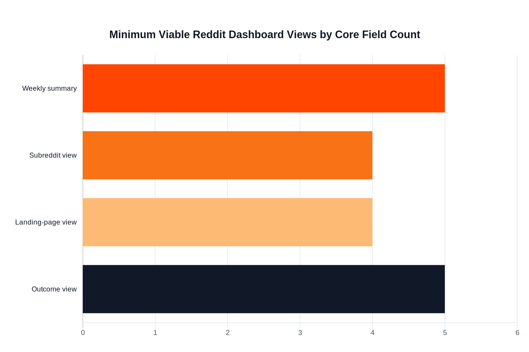
What Belongs in the Minimum Viable Dashboard?
The minimum viable Reddit dashboard usually needs one summary page and three breakdowns: subreddit, landing page, and outcome. Anything beyond that should earn its place by changing a weekly decision.
This is the lean version:
| View | What it answers | Minimum fields |
|---|---|---|
| Weekly summary | Did Reddit help this week? | Sessions, engaged sessions, key events, top subreddit, top landing page |
| Subreddit view | Which communities are worth another post? | Subreddit, traffic, engagement quality, key events |
| Landing-page view | Which destination handled Reddit traffic best? | Page path, sessions, engagement, conversion rate |
| Outcome view | Did traffic lead to meaningful next steps? | Leads, sign-ups, purchases, assisted actions, notes |
That is enough for most small teams.
If you are still tagging traffic manually or trying to clean up inconsistent campaign names, fix How to Track Reddit Referral Traffic first. A dashboard cannot rescue bad instrumentation.
Which Metrics Deserve a Permanent Place?
Permanent metrics should show scale, quality, and outcome together. A dashboard that reports only top-line traffic will reward the wrong posts. A dashboard that reports only conversions will hide useful learning from smaller experiments. The job is balanced visibility, not one perfect metric.
Use a permanent metric set like this:
| Metric group | Keep it? | Why |
|---|---|---|
| Sessions or users from Reddit | Yes | Gives the weekly scale baseline |
| Engaged sessions or engagement rate | Yes | Shows whether the traffic was curious or actually interested |
| Key events | Yes | Connects Reddit work to outcomes |
| Landing-page conversion rate | Yes | Reveals mismatch between thread promise and destination |
| Thread score alone | No as a headline metric | Useful context, weak business signal |
| Vanity follower counts | No | Usually too detached from real outcomes |
This is where Reddit Marketing KPIs That Matter and How to Measure Community Engagement on Reddit should sit beside the dashboard article. They help define what belongs in the metric layer before you build more views.
Which Reporting Views Matter Most Week to Week?
Most Reddit teams need four recurring views: trend, community, destination, and interpretation. If one of those views is missing, the dashboard will answer what happened without helping you understand why.
Use this weekly layout:
| View | Weekly question | Example action |
|---|---|---|
| Trend view | Did Reddit improve or decline overall? | Increase or reduce posting cadence |
| Community view | Which subreddits are producing useful response? | Repost the angle in the strongest communities |
| Destination view | Which page handled Reddit traffic well? | Route more traffic to the stronger page |
| Interpretation notes | What changed and why? | Document a test, rule change, or thread pattern |
The interpretation layer is the one people skip.
But without it, the dashboard becomes a spreadsheet graveyard with no institutional memory.
That matters because Reddit context changes faster than most reporting surfaces do.
How Should You Score Quality, Not Just Volume?
The fastest way to ruin a Reddit dashboard is to let click volume dominate every view. A high-volume thread can still be a bad business result if it sends the wrong audience to the wrong page. Quality scoring gives the team permission to back a smaller but sharper traffic source.
You do not need an elaborate formula.
You do need a clear rule for what quality means.
A simple quality score can weigh:
- engaged sessions
- key-event rate
- landing-page conversion rate
- comment quality or downstream feedback notes
That score should stay explainable.
If no one on the team can tell you why one subreddit outranked another, the model is too complicated.
For the attribution side of that conversation, keep Reddit Attribution Models for Marketers nearby.
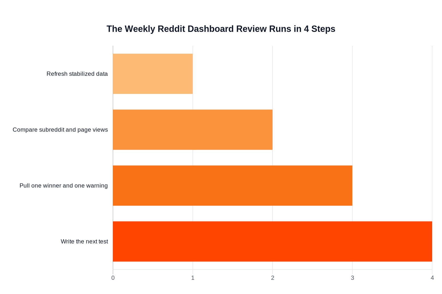
What Weekly Operating Cadence Keeps the Dashboard Useful?
A Reddit dashboard is only useful when it supports a repeatable weekly review. The best cadence is short, comparative, and tied to next actions. If the dashboard review does not end in a decision, the dashboard is too broad or too vague.
Use a weekly routine like this:
- Refresh the summary only after the reporting window has stabilized.
- Review subreddit and landing-page performance side by side.
- Pull out one winning pattern and one warning sign.
- Write the next test directly into the dashboard notes or reporting doc.
This keeps the dashboard tied to operations rather than presentation.
It also prevents the common trap of rebuilding the report every week because nobody agreed on the point of it.
When Should You Add More Complexity?
You should add more dashboard complexity only when a missing view is blocking a decision you already know you need to make. Complexity is justified by repeated operational friction, not by curiosity.
These are reasonable upgrade triggers:
| Add this | Only when you need it | Why |
|---|---|---|
| Search Console layer | Reddit threads are influencing branded or topic search demand | Helps connect direct visits to broader discovery |
| Assisted-conversion view | Reddit often appears early but not last in the path | Helps frame influence honestly |
| Campaign comparison view | You run enough Reddit pushes to compare format families | Avoids reinventing analysis each launch |
| Executive summary tab | Stakeholders need a shorter decision view | Keeps leadership out of raw tables |
If you have not already mastered the minimum viable dashboard, do not build the upgrade yet.
The overbuilt dashboard trap is real.
More widgets usually means weaker decisions, not better insight.
What Mistakes Make a Reddit Dashboard Useless?
Most useless Reddit dashboards fail because they try to impress stakeholders instead of helping operators. A dashboard should reduce confusion, not display every metric the stack can export.
The recurring failures are:
- mixing paid, organic, comment, and profile traffic without labeling it
- reporting same-day numbers as if they were final
- hiding landing-page performance behind one channel total
- ranking success by score or sessions alone
- omitting a notes field that explains context, rule changes, or anomalies
If you avoid those mistakes, the dashboard can stay small and still be powerful.
And once that happens, the next gain usually comes from better content decisions, not more reporting tabs.
About the author
Mike
Editorial lead for Reddit growth and buyer-side education
Mike writes practical breakdowns on buying Reddit upvotes, comparing providers, and spotting the quality signals that matter before you place an order.